Dave is a marketing expert with 15 years experience in the tech and SaaS world. He specializes in educating IT and channel audiences, with a focus on security, privacy, compliance, and marketing technology. With a talent for storytelling and a deep understanding of the industry, Dave transforms complex IT topics into clear, engaging, and impactful narratives.
Choosing the best email signature fonts
TL;DR
Email-safe fonts like Arial, Calibri, Georgia, Verdana, and Tahoma display consistently across devices and clients
Microsoft has replaced Calibri with Aptos as the Microsoft 365 default, but Aptos isn't web-safe: recipients without it installed just see a different font
Custom or brand fonts need a font stack (a list of fallback fonts) to avoid breaking for recipients who don't have them installed
Stick to 10–12 pt font size and dark, high-contrast colors for readability and accessibility
With Exclaimer's cloud solution, IT teams can define and enforce approved fonts across Microsoft 365 and Google Workspace, from desktop to mobile, with no manual updates needed
Choosing the right font is about ensuring your message looks the same for every recipient, on every device, and in every email client. If the font you use isn't supported, it can be replaced with a default system font, causing layout issues or breaking your design.
When email signatures are standardized with approved fonts, your business communication looks consistent, accessible, and on-brand across the board.
Using web safe fonts for email signature designs
Using a web safe font in an email signature will almost always guarantee the font appears on the recipient's end as intended. These are fonts pre-installed on nearly every device, so there's no guessing about how they'll render. They're easy to read and aren't overly decorative.

A web safe font is one that's installed on almost every Windows and Mac device by default. They're available for display on common web browsers like Chrome, Firefox, and Microsoft Edge, as well as standard operating systems like Windows, iOS, macOS, and Android. If you use it in an email signature, it will look the same on the recipient's end.
Here are some proven choices for business email signatures:
Arial: Simple, widely supported, and professional. Arial is a safe default that works across all devices and operating systems.
Calibri: Clean and modern, Calibri displays well on both Windows and macOS. It's a familiar choice that balances readability with a softer appearance.
Verdana: Designed for digital screens, Verdana's generous spacing improves legibility on smaller displays and mobile devices.
Georgia: A strong serif font that conveys professionalism and credibility. It's a good fit for industries like law, finance, or education.
Tahoma: Compact and clear. Tahoma is ideal for organizations with space constraints or more detailed contact information.
Helvetica: Balanced, neutral, and timeless. Helvetica works well for modern brands that value simplicity and precision.
"Think of your font sizes as a hierarchy. Use 12 to 11 point for the most important text — your name, job title, maybe a greeting if you want one. 10 to 8 point works well for contact details, phone numbers, and your website. Then 8 to 7 point for disclaimer text, or anything less important that you don't need someone to read straight away. It's a hierarchy, and it works across other materials too, especially print."
A 2006 study by Wichita State University's Software Usability Research Laboratory found the same pattern at a broader level: serif fonts score highest on traits like stable, practical, and formal, while sans-serif fonts don't register strongly on any single personality trait. That's evidence for why serif and sans-serif read differently in general, not a verdict on the specific pairings above (Georgia for law and finance, Helvetica for modern brands)
So which is the best font for an email signature? Here's a breakdown of the safest choices by platform. "Varies" means support depends on the specific OS version or device, not a fixed rule, so treat it as a caution rather than a coin flip:
Font | Windows | macOS | iOS | Android | Webmail | Notes |
|---|---|---|---|---|---|---|
Arial | ✓ | ✓ | ✓ | ✓ | ✓ | Widely cited as safe |
Georgia | ✓ | ✓ | ✓ | ✓ | ✓ | Strong email-safe serif |
Verdana | ✓ | ✓ | ✓ | Varies | ✓ | Safe font with unclear Android support |
Tahoma | ✓ | Varies | Varies | ✓ | Varies | Supported on Windows & Android; others less certain |
Helvetica | Varies | ✓ | ✓ | Varies | Varies | Strong on Apple platforms |
Calibri | ✓ | Varies | Varies | Varies | Varies | Long-time Windows/Office default (2007–2024). Still widely installed, but no longer Microsoft's default for new Microsoft 365 installs (see Aptos below) |
Aptos | Varies | ✗ | ✗ | ✗ | ✗ | Microsoft's new Microsoft 365 default, replacing Calibri. Not web-safe: Outlook's own font stack for Aptos falls back to generic sans-serif rather than naming a specific font, so there's no guaranteed match for what a recipient without it sees. Independent testing found the substitute is usually close to Calibri, but that's not guaranteed |
Times New Roman | ✓ | ✓ | ✓ | ✓ | ✓ | Broadly supported classic serif |
Trebuchet MS | ✓ | ✓ | ✓ | Varies | ✓ | Safe on most platforms; Android less clear |
Courier New | ✓ | ✓ | ✓ | ✓ | ✓ | Font for code/email use |
Tip
Your email signature's font and your general Outlook compose font are two separate settings, and changing one doesn't change the other. If your signature suddenly looks different after a Microsoft 365 update, check the font selected inside the signature editor itself, not just your general Outlook font preference.
Fonts to avoid
Fonts that don't render consistently or are difficult to read can undermine your professionalism. Avoid:
Script or cursive fonts (e.g., Brush Script, Lobster)
Decorative fonts (e.g., Comic Sans, Papyrus)
Custom web fonts that rely on external hosting
These fonts often get replaced with system defaults, disrupting formatting and brand consistency.
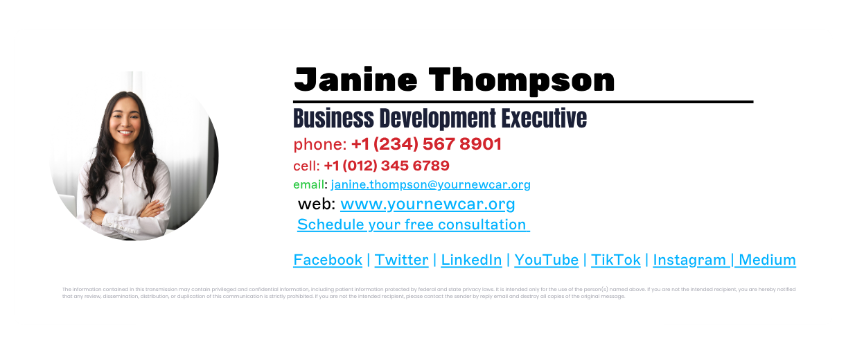
Using custom fonts in email signatures
Custom fonts, like web fonts created specifically for a company, can technically be used in email signatures. The catch: custom fonts rely on a CSS (Cascading Style Sheets) feature called @font-face, and support for it is inconsistent. Apple Mail supports it, Outlook only partially, and Gmail and Yahoo Mail don't support it at all. Where it isn't supported, the email client substitutes its own default font instead.

The same applies to Google Fonts. If the recipient's email client doesn't render @font-face, the signature falls back to whatever font that client defaults to, not necessarily the one you intended.
This is exactly where a company's brand font trips people up: it's been signed off for letterheads and business cards, so it looks safe to reuse.
A font stack fixes this properly. Instead of specifying one font and hoping, you list a preferred font followed by one or more fallback fonts, in that order. If a recipient's device doesn't have the first font, the email client works down the list until it finds one it can render.
Aptos is a case in point. It's Microsoft's own new default, but it isn't installed everywhere, so treating it like a safe choice for an email signature is exactly the mistake this section is warning against. Including Aptos in a font stack means recipients who have it see it, and everyone else gets a defined fallback instead of whatever the email client happens to pick. Adding it directly as a one-off custom font instead of through a font stack forces the whole signature to render as a bitmap image, which brings its own problems: Outlook removes hyperlinks from bitmap signatures, and some Apple devices drop bitmap images entirely to save space.
Other reasons to avoid using custom fonts include the following:
Difficult to read. Non-web safe fonts will make your email signature template often illegible. If the email signature font makes it too difficult for recipients to see the contact information, it can cause frustration.
Negative impact on your brand. Email signatures are an online reflection of your business. It directly correlates to the professionalism of your brand. Using messy email signature fonts makes the template hard to read and negatively affects the recipient.
Font size, color, and hierarchy tips
Choosing the right size and color helps your email signature stay readable, accessible, and visually balanced. The goal is consistency across users, departments, and devices.
Font size
Keep your main text between 10 and 12 pt.
Use 12 pt for the sender’s name.
10–11 pt works for job titles, company names, and contact details.
Smaller fonts can look cramped or disappear on mobile.
Larger fonts can make a message feel less professional.
If you’re managing email signatures across an organization, standardize these sizes so every signature feels unified.
Color
Stick to your brand palette. Use dark, high-contrast colors for text, typically navy or neutral gray for best legibility.
Avoid light or bright colors for main text.
Use accent colors sparingly (for example, in a call-to-action or social icon).
Always maintain strong color contrast to meet accessibility standards such as WCAG (Web Content Accessibility Guidelines) AA or higher.
Hierarchy
Use weight and spacing, not multiple colors or fonts, to guide the reader's eye.
Make the sender's name slightly larger or bolder than the rest of the text.
Keep spacing consistent between each line of information.
Avoid italics or all-caps except where necessary (like department names).
How to ensure font consistency across an organization
Even if you choose the right email-safe font, keeping it consistent across every employee and device can still be difficult. Users might change their settings, different operating systems render fonts differently, and mobile clients often apply their own defaults.
 That inconsistency adds up. Emails start to look off-brand or unprofessional, especially when multiple departments use different templates.
The best way to solve this is with centralized control.
With Exclaimer's email signature software, IT teams can:
Define approved fonts, sizes, and colors once.
Automatically apply them to every user, across Microsoft 365 and Google Workspace, from desktop to mobile.
Enforce font stacks and fallback rules to prevent unsupported fonts from breaking layouts.
Give marketing and compliance teams limited access to update templates without losing IT oversight.
This means every outbound email, from any device or location, looks professional, accessible, and on-brand.
The font mismatches in this article are the kind that go unnoticed until a client, a candidate, or a board member points one out.
See exactly what your organization's email signatures render as, on every device, before that happens: book a custom walkthrough or start a free trial.