James is an experienced product specialist with a strong background in the IT and SaaS industry. As Senior Product Marketing Manager at Exclaimer, he plays a key role in showcasing the value of centralized email signature solutions and transforming them into a powerful communication tool for organizations.
Top 5 virtual background mistakes (and how to avoid them)

Video calls are now one of the most frequent ways your company shows up to clients, partners, and each other. Businesses spend real effort on their brand across websites, email signatures, and social channels. The video call background, though, is usually left to whoever happens to be on camera.
The result is predictable. Cluttered rooms, personal photos, and mismatched visuals turn up on calls where first impressions matter. None of it is deliberate. It’s just what happens when nobody sets a standard.
Here are the five virtual background mistakes we see most often, and how to fix each one.
The five mistakes, at a glance:
Mistake 1: No agreed standard
When every employee decides their own background, you get a different look in every window. One person has a tidy bookshelf, another has a beach photo, a third has the blur turned up so high that their head keeps disappearing. On an internal call it’s mostly harmless. But on a client pitch, it reads as a company that hasn’t thought about how it presents itself.
This is the root mistake that most of the others stem from. Without a shared standard, consistency is left to chance, and the results are rarely good.
How to avoid it: Set an approved standard
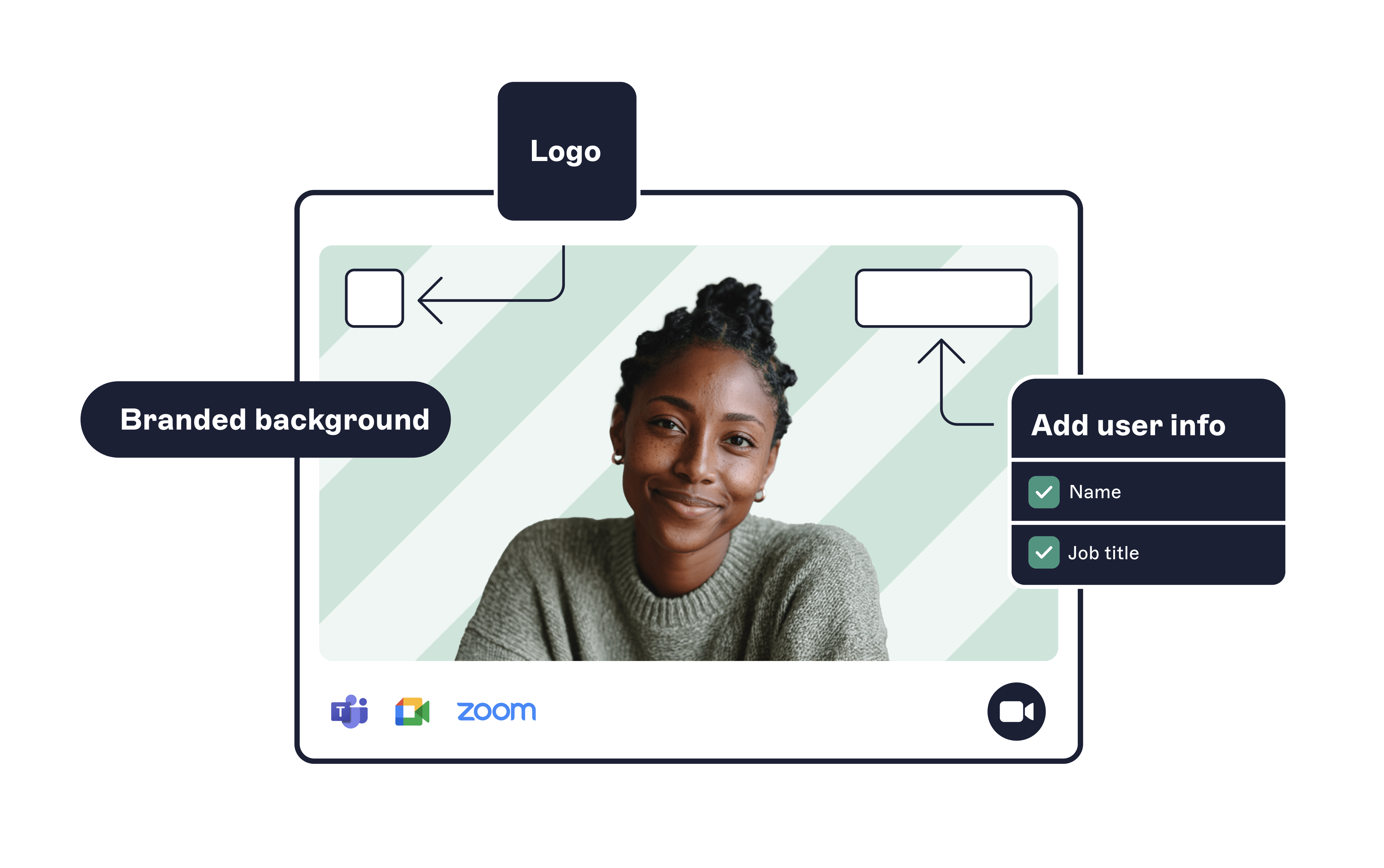
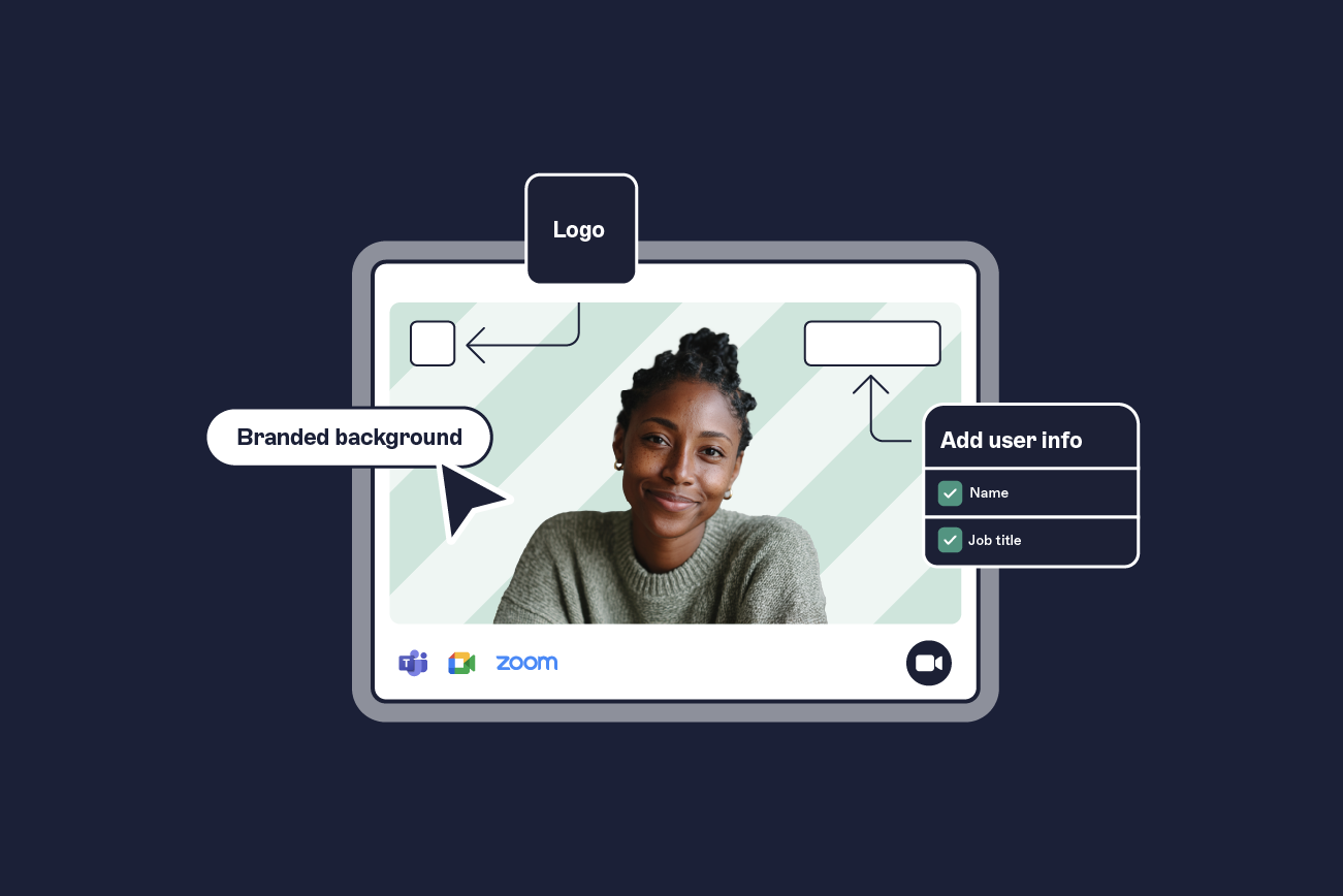
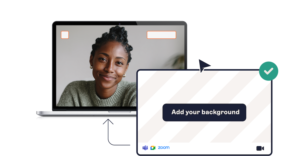 Decide what “on brand” looks like for a video call and write it down. Define the background, the logo placement, and whether a nametag appears. A tool that pushes approved meeting themes to everyone makes the standard stick without relying on goodwill.
Mistake 2: No name or job title on screen
Platforms show a small display name in the corner, and it’s easy to miss. On a large or cross-functional call, that leaves people guessing who’s speaking and what they do. Introductions get repeated, names get forgotten, and the conversation loses a little momentum every time someone has to ask.
How to avoid it: Add a nametag with name and role
Add a nametag showing the person’s name and role. It sits in view for the whole call, so nobody has to remember who’s who. This matters most on external calls, where a client meeting three of your colleagues at once can place each of them instantly.
 Pulling the name and title from your existing directory keeps these details accurate automatically, so a new hire or promoted employee shows up correctly without anyone editing an image by hand.
Mistake 3: Using one background for every type of meeting
A single company background is a step up from chaos, but it treats a client webinar and a Monday stand-up as the same event. They’re not.
An external pitch calls for a background with a tagline or campaign message. An internal catch-up needs nothing more than a clean, branded backdrop. One design for all of it either overdresses casual calls or underdresses important ones.
How to avoid it: Build a few context-specific templates
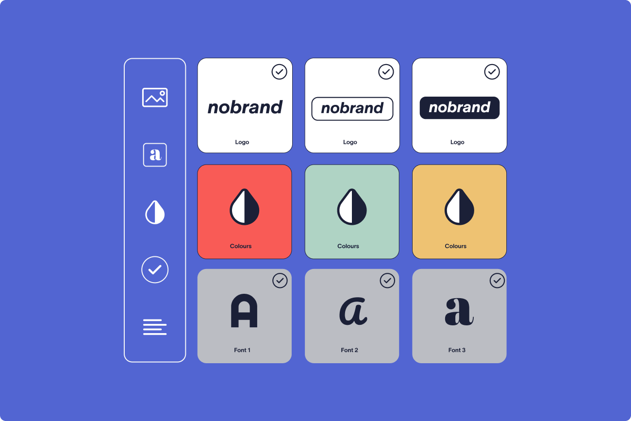
Build a small set of templates for the contexts you actually meet in: internal, external, and client-facing is enough for most teams. Keep the core brand elements consistent across all of them so they still read as one company, and let the message shift to fit the room. A handful of well-made options covers almost every meeting without becoming a design project.
Mistake 4: Poor image quality and setup
Even a good design falls apart at low resolution. Backgrounds turn blurry, logos pixelate, text becomes unreadable, and text or logos can appear reversed depending on your mirror settings. Lighting and camera setup do the rest. Poor edge detection leaves halos around hair and shoulders, and a dim room undoes the effort entirely.
How to avoid it: Match the platform’s specs and pilot first
Export images at the resolution each platform recommends.
Platform | Recommended minimum | Format |
|---|---|---|
Zoom | 1280 x 720 pixels (16:9) | JPEG or PNG |
Microsoft Teams | 1280 x 720 pixels (16:9) | JPEG or PNG |
Treat 1280 x 720 as the safe floor across both platforms. Zoom's own background guidance confirms this minimum, and Microsoft's published guidance for Teams starts at the same figure. Check that any text stays legible once the platform crops and scales it. Before a company-wide rollout, run a short pilot across a mix of devices, cameras, and lighting setups, and note where edges look rough or logos sit awkwardly. A few minutes of testing saves hours of cleanup later.
Mistake 5: Managing backgrounds by hand
Even a well-designed set of backgrounds breaks down without a way to distribute and update it. Multiply a standard, nametags, and a handful of templates across hundreds of employees, then add brand refreshes and role changes on top.
Emailing a zip of image files and hoping people apply them correctly doesn't scale, and it falls apart the moment anything changes. Manual distribution is where good intentions quietly expire.
How to avoid it: Manage backgrounds centrally
Manage backgrounds centrally, the same way you already manage email signatures. Create the templates once, assign them, and roll updates out from one place instead of chasing individuals.
 When a background is controlled centrally, a rebrand becomes a single change rather than a company-wide scramble, and new starters get the right look from day one.
How to fix all five at once
A shared cause runs through all five mistakes above: no central control over how backgrounds are created, distributed, and kept current. Exclaimer's Meeting Branding gives IT one place to create, personalize, and deploy video call themes across Zoom, Microsoft Teams, Google Meet, and other platforms.
 Each background is automatically personalized with the employee’s name, job title, and your logo, all pulled from the same directory that feeds your email signatures. There’s no new system to set up. Template locking keeps the design consistent, and details update automatically when someone’s role changes.
Zoom users get the full experience through the Exclaimer Zoom app, which applies their theme for them. On Teams, Google Meet, and other platforms, users download their personalized theme and apply it with the platform’s own background settings.
Meeting Branding is included with your Exclaimer Pro plan and as part of the 14-day free trial. This is the only native video call branding offered by an email signature management provider. For the 80,000+ organizations already standardizing their email signatures with Exclaimer, it's the same control applied to video. Get a free trial of Exclaimer today.