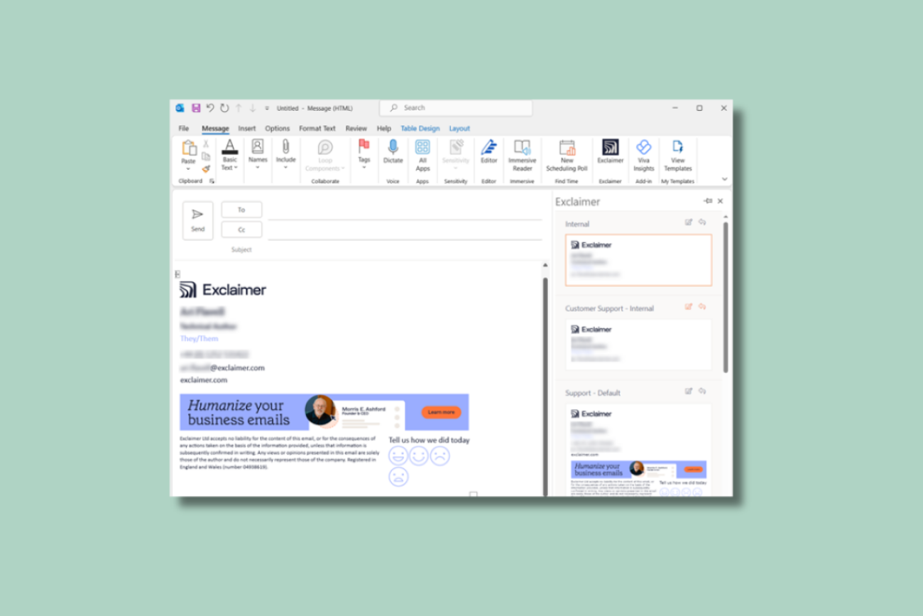
Naimh is a seasoned marketer of 12 years, including in SaaS and tech. She’s an expert at simplifying complex technology concepts, bridging the gap between IT and marketing. Naimh specializes in turning tech speak into actionable insights, helping marketers get the most out of their tools and technology.
How to change the background color on Outlook email (and in your email signature)
TL;DR
To change the background color of an Outlook email, open a new message, go to Options > Page Color, and pick a color. This changes the whole message body.
Outlook has no direct background-color button for email signatures. Build a borderless, shaded table in a new message, then paste it into your email signature.
Apply background color to every element of your email signature individually, not one big block. Outlook renders large color areas unevenly and leaves white gaps between sections.
Test any email signature background color in dark mode before rolling it out. Support varies a lot by client, so check the actual result rather than assuming.
For more than a handful of email signatures, a centrally managed platform sets the color once and keeps it consistent everywhere, instead of everyone repeating the same manual steps.
Changing the background color of an Outlook email is a simple way to personalize a message or reinforce a brand color. It's a different job, mechanically, from changing the background color of your email signature. Outlook treats the two separately, and the email signature version has a few failure modes worth knowing about before you roll it out to more than one person.
This guide covers both, starting with the email itself.
How to change the background color in Outlook email
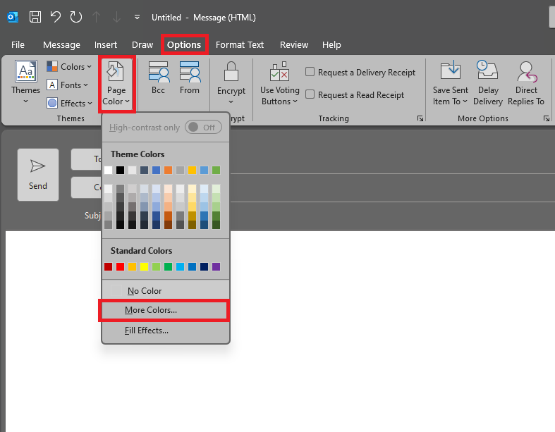
Open Microsoft Outlook and create a new email message, or open an existing draft.
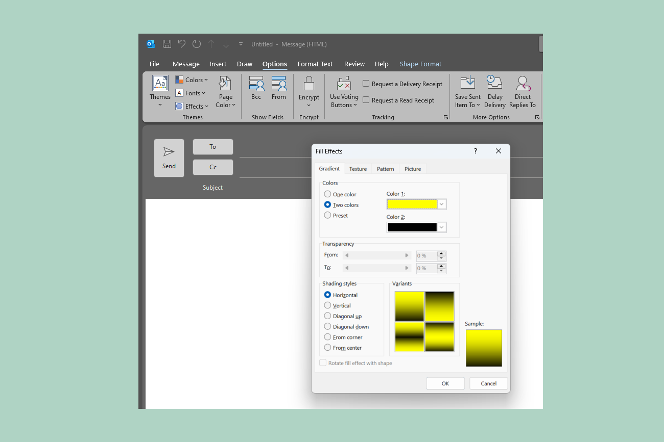
Go to Options > Page Color.
Select a color from the palette, or choose More Colors for a specific hex code.
Select No Color to remove a background color you've already applied.
Choose Fill Effects instead of a flat color if you want a gradient, texture, pattern, or picture background.
This changes the background of the message body itself: everything the recipient sees when they open the email, not just your email signature block.
Adding patterns, textures, or images instead of a flat color
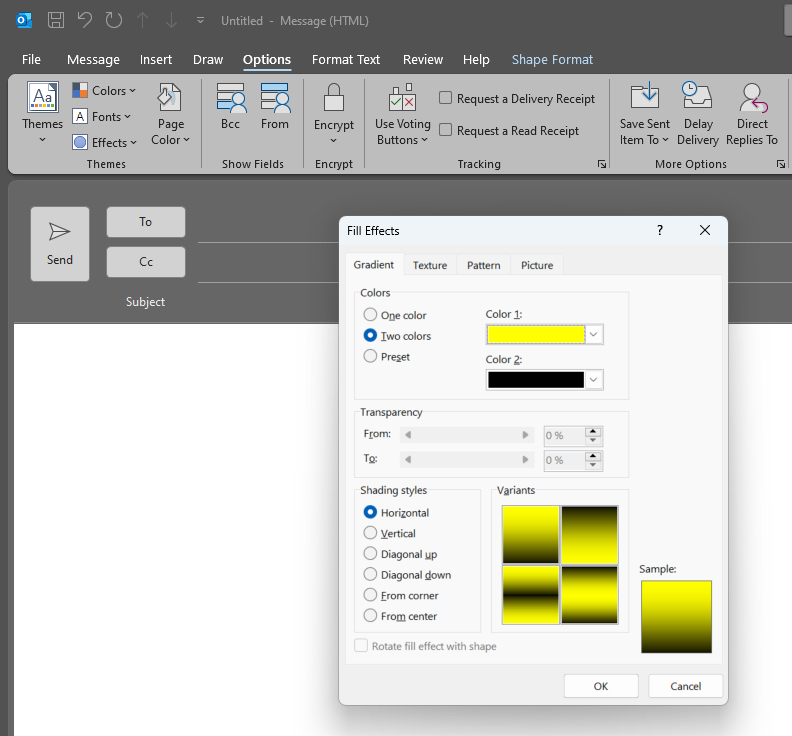
Fill Effects (under Options > Page Color > Fill Effects) gives you four tabs beyond a flat color:
Gradient: a smooth transition between two colors, or shades of one.
Texture: built-in textures (marble, paper, wood grain, and similar).
Pattern: stripes, dots, and other repeating designs, in colors you choose.
Picture: upload your own image as the background.
If you use a picture, keep the file size reasonable. A large, unoptimized image will slow the email's load time for the recipient more than a solid color or simple pattern ever will.
Choosing the right background color for the message
The right color depends on the email's tone as much as its content.
For formal or professional emails (client updates, job applications, internal announcements to leadership): Stay with muted, low-saturation colors: navy, gray, and soft beige. A light background with dark text keeps the message easy to read and doesn't compete with the content. Save vibrant patterns for casual mail.
For casual emails (friends, family, internal team banter): There's more room to experiment: brighter colors, playful patterns, or an image that reflects your personality. The one rule that holds is that the choice should support the content, not fight it for attention.
Contrast. Dark text on light backgrounds, light text on dark backgrounds. The Web Content Accessibility Guidelines (WCAG) 2.1 AA standard calls for a contrast ratio of at least 4.5:1 between text and background for normal-sized text, or 3:1 for large text (18pt+ regular, or 14pt+ bold). That's a useful benchmark even outside any formal compliance requirement.
Consistency. If you're sending a series of related emails (a newsletter, a campaign), keep the background consistent across them so recipients recognize your messages at a glance.
Audience. A background color that reads as "creative" to one recipient can read as "unprofessional" to another. When in doubt, especially for external mail, default toward the safer, more muted end.
What about your email signature?
Everything above changes the message. It doesn't affect your email signature, because Outlook stores and renders email signatures separately from the message body. It gives you no direct way to set an email signature's background color at all.
If you want your email signature (not just this one email) to carry a background color, that's a different, more manual process, with a couple of failure modes the message-background trick doesn't have.
How to add a background color to your email signature
Outlook's email signature editor doesn't expose the table-formatting tools you need, so you build the colored element in a regular message first, then move it into your email signature:
Open a new email message, not the Signatures window; you need the full ribbon, which the email signature editor doesn't have.
Go to Insert > Table and choose a 1x1 table.
Type your email signature details into that table cell, or paste them in.
Select the table, go to the Table Design tab, and click Shading. Pick a color from the palette, or select More Colors for a specific hex code.
Select the table again, go to Table Design > Borders, and choose No Border so only the color shows, not a table outline.
Select the whole table and copy it (Ctrl+C).
Go to File > Options > Mail > Signatures, select the email signature you want to edit (or create a new one), and paste the colored table into the editing box.
Save, then send yourself a test email to see how it actually looks once sent, not just how it looks in the editor.
If you're on New Outlook for Windows, its email signature editor (Settings > Accounts > Signatures) doesn't support table formatting at all: no Insert > Table, no Shading.
Build the table in OneNote or PowerPoint instead of a regular message, with the shading and border already set the way you want, then copy and paste the finished result into the email signature editor. Building it in Word specifically can introduce its own border problem, covered in the note below, so OneNote or PowerPoint is the safer choice for this particular workaround.
If a border you removed comes back on its own: this has happened before. Microsoft documented and fixed one such case in classic Outlook in early 2026, tracing it to Word (which Outlook uses as its rendering engine) applying a non-zero border behind the scenes. If shading or borders you set start behaving differently overnight, check for a pending Outlook update before assuming you did something wrong.

Why your email signature's color looks different once you send it
Outlook renders background colors per element, not as one continuous fill. If you've colored a whole block of grouped email signature content as a single unit, you'll often see thin white lines or gaps appear between sections once the email actually sends, even though the preview looked solid. This is a known Outlook rendering issue, not something an email signature tool can override, and it's distinct from the message-background trick above, which doesn't have this problem because a message background is one flat layer rather than a stack of table cells.
Exclaimer's own troubleshooting documentation for this exact issue recommends three fixes:
Color every element separately. Apply the background color to each individual table, cell, and text block rather than one large canvas.
Set stretch alignment on elements so they fill their available space instead of leaving Outlook to guess at spacing.
Fix your row and column widths instead of leaving them on "auto." Auto-sized cells are exactly what Outlook resizes unpredictably, which is where the gaps come from.
Tip
If you're building the email signature table manually, apply shading to each cell you insert, not to the outer table as a whole. It's more repetitive, but it holds up better once the email actually sends.
Does an email signature background color work in dark mode?
Not evenly, and it isn't fully your call. Apple Mail supports the CSS control that lets a sender define exactly how an email signature should look in dark mode. Outlook only partially supports it. Gmail and Yahoo Mail don't support that control at all. That doesn't mean they leave your colors untouched, though: Gmail's desktop webmail and Yahoo Mail generally leave email bodies as designed, but Gmail's mobile apps automatically invert colors without asking. Testing services don't fully agree on how complete that inversion is on Android specifically, which is itself a sign of how unpredictable this is to design around rather than something with one clean answer.
"Dark mode can mute colors and change how images read. One practical fix is to put a white background on an image, or add a stroke to text-based elements, so they stay legible if the canvas goes dark."
Because you can't fully control what Gmail or Yahoo Mail do to your colors, picking the theoretically "right" color matters less than checking the actual result. Send yourself a test email and look at it with dark mode switched on, in whichever clients your recipients actually use.
DIY vs. centrally managed: which approach fits?
Manual (Outlook table edit) | Centrally managed (Signature Designer) | |
|---|---|---|
Setup effort | A few minutes per mailbox | One template, applied to every mailbox at once |
Consistency across a team | Depends on everyone repeating the same steps correctly | Enforced automatically; no per-person variation |
Preventing white gaps between colored elements | Manual, cell-by-cell, repeated for every email signature | Set once, at the template level |
Dark mode testing | Per person, per client, by hand | Tested once against the template, then applied everywhere |
Best fit | One person, one mailbox, occasional changes | More than a handful of people, or any brand-consistency requirement |
If you're the only person who needs this email signature, the manual method above is genuinely fine. The moment a second person needs the same look, someone has to either walk them through the same eight steps or accept that their version will drift.
Keeping email signature background colors consistent across a whole team
Centralized email signature management solves the exact problem manual edits can't: one person's version drifting from another's the moment more than a couple of people are involved.
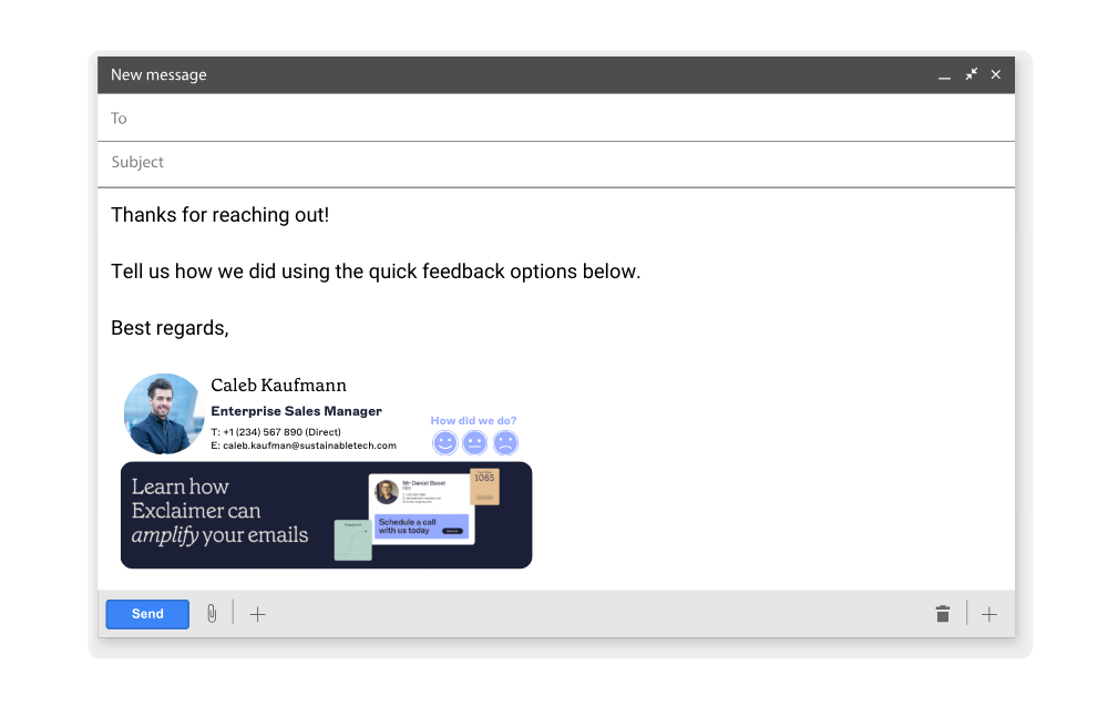
In Exclaimer's Signature Designer, a background color is a property you set once per element, the same fix described above for the white-gap issue, and it applies identically across every mailbox using that template. Brand Kits let you save your two core brand colors once and reuse them as background, text, or border colors anywhere in the design, so nobody's picking a slightly-off hex code from memory.
That still leaves the question of who gets to set it. In a 500-plus-employee organization with more than one brand or business unit, the color choice usually shouldn't sit with IT at all, and role-based access handles that directly: IT defines the limits once, then hands the actual color decision to marketing or a brand team within them, instead of fielding a hex-code request every time a department updates its look.
See how Exclaimer keeps email signature colors consistent across every mailbox, or book a demo if you're ready to see it built around your own brand.