Naimh is a seasoned marketer of 12 years, including in SaaS and tech. She’s an expert at simplifying complex technology concepts, bridging the gap between IT and marketing. Naimh specializes in turning tech speak into actionable insights, helping marketers get the most out of their tools and technology.
The 17 DOs and DON’Ts of email signatures
TL;DR
Centralize the design instead of letting each employee build their own, using HTML tables rather than bullet points, custom fonts, or a stand-in image for the whole thing.
Keep the whole signature under 600px wide and test it in Outlook, Gmail, and Apple Mail before rolling it out. Rendering breaks are the most common failure, not bad taste.
Add a legal disclaimer where one's required, and keep images light with real alt text. None of that is optional anymore.
Use Exclaimer to automatically apply a consistent, on-brand email signature to every user, with no manual updates needed.
Get the basics of email signature design right
A well-designed email signature does its job quietly. It keeps contact details accurate, reinforces brand consistency, and doesn’t give your IT team another ticket to deal with.
 But it’s easy to get wrong. Too much information, poor formatting, or mismatched styles across teams can cause more harm than good.
As an email signature management provider, we know a thing or two about email signature design. We know what many companies get right and what they get wrong.
This list covers 17 dos and don'ts that make a difference in email signature design, whether you're managing a few dozen users or thousands. These are the basics that help keep your email signatures clean, consistent, and under control.
Need the basics first? This beginner's guide explains core concepts before you apply the rules. A smart way to avoid these common pitfalls is to build a draft in an email signature design tool first.
Quick reference: email signature specs
The rules below are guidance from Exclaimer's own template design team and what they give to customers day to day.
Element | Recommendation |
|---|---|
Total width | 600px on desktop; 320-450px for a dedicated mobile build |
Logo size | 200x200px |
Headshot size | Around 100x100px if you're using one |
Image file size | Keep it light. One logo or one headshot, not both at full resolution |
Image dimensions | Hardcode width and height in the HTML for every image |
Fonts | Web-safe only: Arial, Calibri, or a similar sans-serif fallback |
Font size | 11-12pt for name and job title, 8-10pt for contact details, 7-8pt for disclaimer text |
Layout | HTML table with transparent borders, not divs |
Contrast | A white background behind a logo, or a stroke on text-based elements, keeps it visible in dark mode |
Line length | Short enough to leave margin either side of a 600px email signature, or expect a wrap |
1. Do connect email signature design to social media
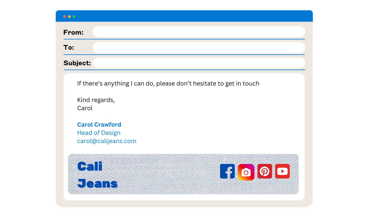
Social media is part of your digital brand, so it should feature in your email signature. Link to the company page, an individual profile, or current content: a new blog post or customer story.
Company Follow buttons can still work: Unilever added one to its corporate email signature back in 2012 and grew its follower count from 40,000 to 235,000 in 10 months.
But LinkedIn itself has shifted a lot since then. A Refine Labs study found personal profiles pulling 2.75x the impressions and 5x the engagement of the company page on organic posts, despite a smaller following (a small sample, seven employees, and a study of posting, not of signature clicks specifically, but the same "people trust people, not logos" dynamic plausibly carries over).
If reach matters more than brand consistency for a role, which is often true in sales, linking to the individual's own profile is worth considering as the default instead of the company page.
Don’t cram in every platform
Your email signature template will look cluttered if you add an icon for every social media channel your company uses.
We recommend using a maximum of four social media icons in your email signature. Also, only choose the channels that are most regularly updated.
2. Don’t leave it to individuals
When every employee builds their own email signature, inconsistencies are guaranteed. You’ll see outdated logos, typos, mismatched formatting, and broken links across the board.
Only 18% of U.S. organizations manage email signatures with a centralized solution, and 41% still leave it to individual employees, according to Exclaimer's 2025 U.S. Business Email Report. That gap is exactly where inconsistency creeps in.
Centralize the design instead. Signature Rules automatically assign the right template to the right person, so individual employees are never left to build or edit their own. Use a consistent, approved email signature template that reflects your brand and works across devices.
Do use one version for everyone
Whether you're a team of 20 or 2,000, consistent formatting looks professional and prevents support issues.
3. Do use purpose-built tools
Email signatures aren't documents or webpages. If you try to build them in Word, Outlook, or a CMS, you'll run into rendering issues.
If you know HTML, code your email signature to match email standards. If you don’t, use an email signature management solution that does the heavy lifting for you.
Don’t assume Word is ‘good enough’
What looks fine in your email editor can fall apart in Gmail, Apple Mail, or mobile devices.
4. Do use a sensible email signature size
Whether in Gmail, Outlook, or Apple Mail, very wide email signatures will not render well for a recipient. Keep the whole thing to 600px wide or less; that's the width most email clients handle reliably without cropping or wrapping it.
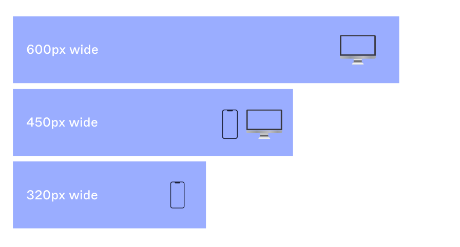
Managing a lot of remote or mobile-first users? Exclaimer's own template design team builds mobile-specific email signatures closer to 320-450px wide [source: Jasmine Hotham-Tunnadine, see spec table below]. That's a narrower target than desktop, designed as its own layout rather than a shrunk-down version of the same one.
Don’t use large image sizes
If you use a logo or a photo of yourself in your email signature, resize the image file itself to match the size you want it to appear at.
If you have a 2000x1500px image file linked in the HTML but coded to display at 500x375px, some email clients ignore the display size and render the original file size instead.
5. Do structure your layout with tables
Jasmine Hotham-Tunnadine, Template Designer at Exclaimer, builds email signature templates "like a piece of architecture": the table first, the content after. A typical marketing signature might run three rows total, with the top row alone split into four columns, each with its own padding for spacing.
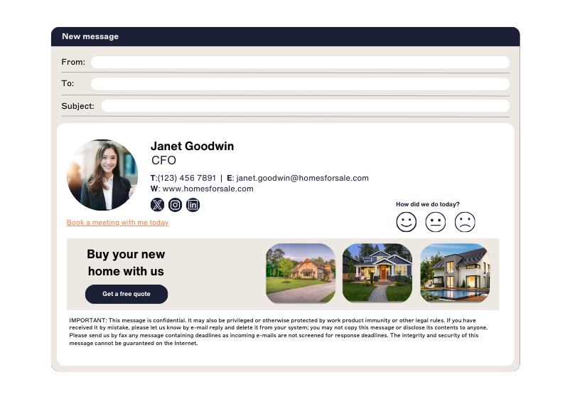 Make borders transparent so they don’t show. Tables aren’t stylish, but they work.
Don’t rely on divs or images to handle layout
Email clients don't behave like browsers. Stick to what's proven to render consistently.
"Don't be afraid to nest tables within tables," Hotham-Tunnadine adds. "Nesting is what keeps alignment correct once a design gets more advanced than a single contact block."
6. Do make an email signature design simple
Your email signature should be clean and functional. Let the content do the work. Over-designed layouts often break across email clients.
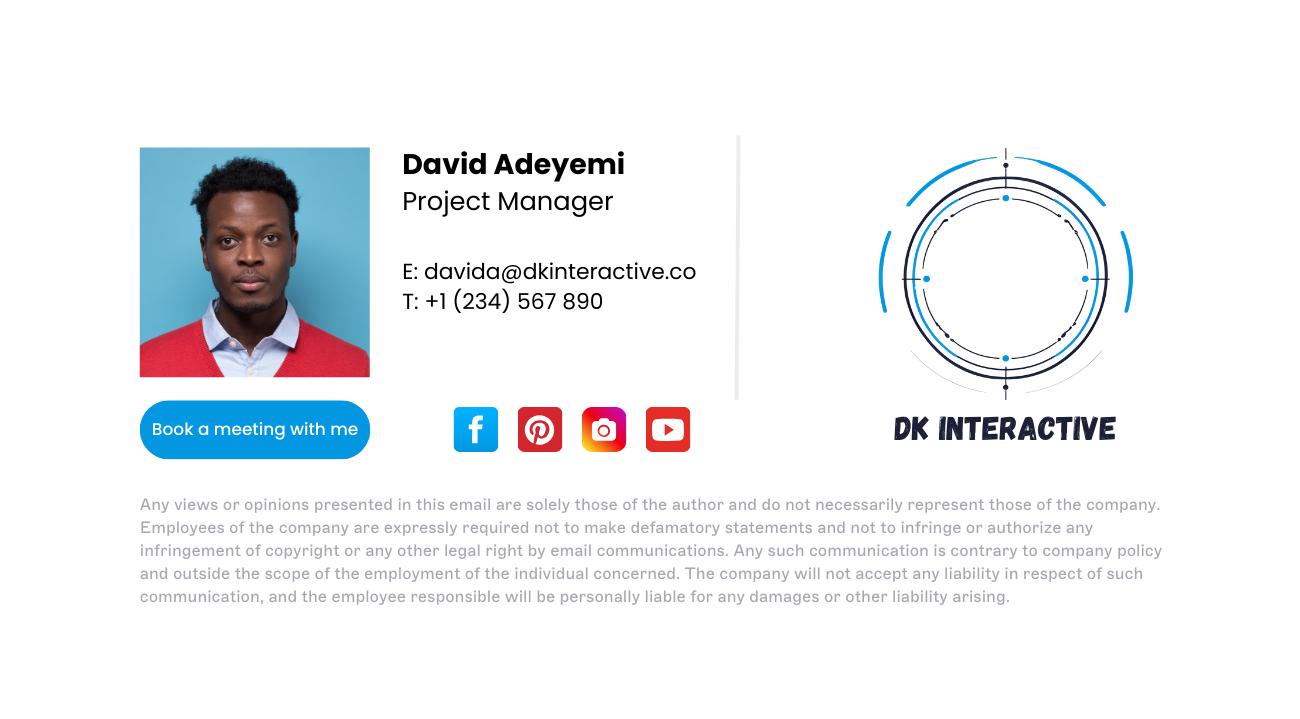 Dark mode adds another wrinkle worth testing for, as it's now the default in Apple Mail on iOS, Gmail's mobile app, and Outlook for Microsoft 365. Exclaimer's own template design team's fix is to "put a white background on the image, or if it's text-based, put in a stroke". Either fix keeps a logo or a text-based element visible instead of letting it disappear into a black background.
If you want to try something ambitious, test it thoroughly across Outlook, Gmail, and Apple Mail.
Don’t skip the basics
Don't overload your signature template with every possible way to contact you. Keep to the basics:
Full name
Job title
Phone number
Website URL
Email address
Keep these details shorter for internal emails and replies.
7. Don’t use bullet points
Bullet points are something you shouldn't include in email signatures. Good email signatures skip them entirely.
This is because they render strangely in different email clients and can ruin the format of your email signature. A bullet point in Outlook will look completely different from one in Gmail.
Do keep the format predictable
Stick with table-based spacing and line breaks. You'll save yourself email signature formatting headaches later.
8. Don’t animate it unless you’ve tested it
Animated GIFs or embedded videos often break in Outlook and other clients. If they don’t render, recipients may just see a broken link or blank space.
 If you're using animation, test it thoroughly and prepare a fallback. Otherwise, keep it static.
The same is true of video. Embedding a native video file directly into an email signature doesn't work in most email clients; video is treated as a security risk, so the content won't play.
Do use static banners or icons when in doubt
Static designs display reliably, load faster, and work in most inboxes.
Use a link with alt text, or a promotional banner, if you'd like to point people toward a video from your email signature.
9. Do make email signatures mobile-friendly
Many emails are opened on mobile devices. Your email signature design needs to be responsive.
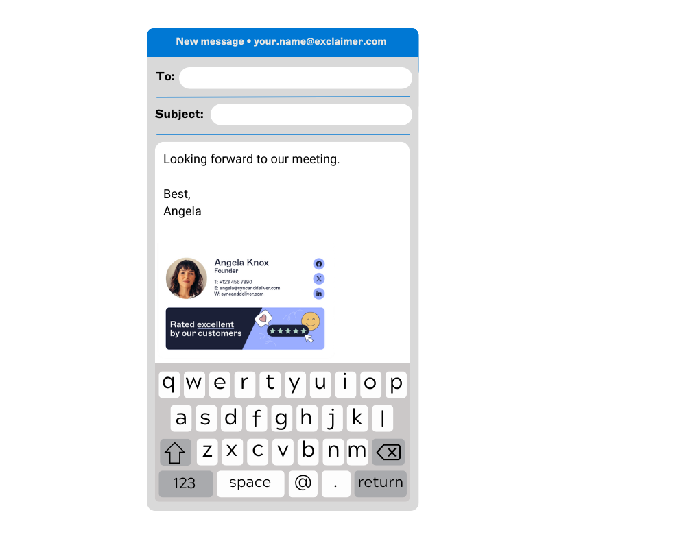 Break up contact details across multiple lines so they don't wrap awkwardly. Test the mobile email signature on different screen sizes to confirm it fits without scrolling.
Don’t assume desktop-first will scale
What looks good on your monitor often breaks on a phone. Design for small screens from the start.
10. Do write full-length HTML
Shortcuts, like WYSIWYG editors or pasted Word formatting, often fail in email environments. They rely on code that email clients don't reliably render.
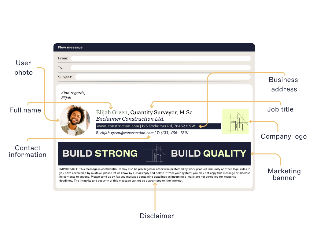
If you're coding it yourself, write the email signature HTML by hand. If you're not, use an email signature generator.
Don’t treat email like a web browser
Web rules don't apply here. Build your email signature the way email clients expect.
11. Do use images in email signatures
Visual elements like logos and banners can reinforce your brand if they’re used correctly.

Host the image on a reliable server and reference it via URL, or embed it if your email platform supports it.
Don’t make your email signature "an image"
Avoid using a single image as your whole email signature:
Most email clients don't automatically download and display images.
The recipient can't copy your contact details.
You can't include multiple hyperlinks in one flat image.
It's harder to update regularly.
An image-only signature is also more likely to land your email in a junk folder or trip a spam filter.
12. Do hardcode image dimensions
Set the exact width and height of every image in your email signature. Without defined dimensions, email clients like Outlook display the image incorrectly or distort its aspect ratio.
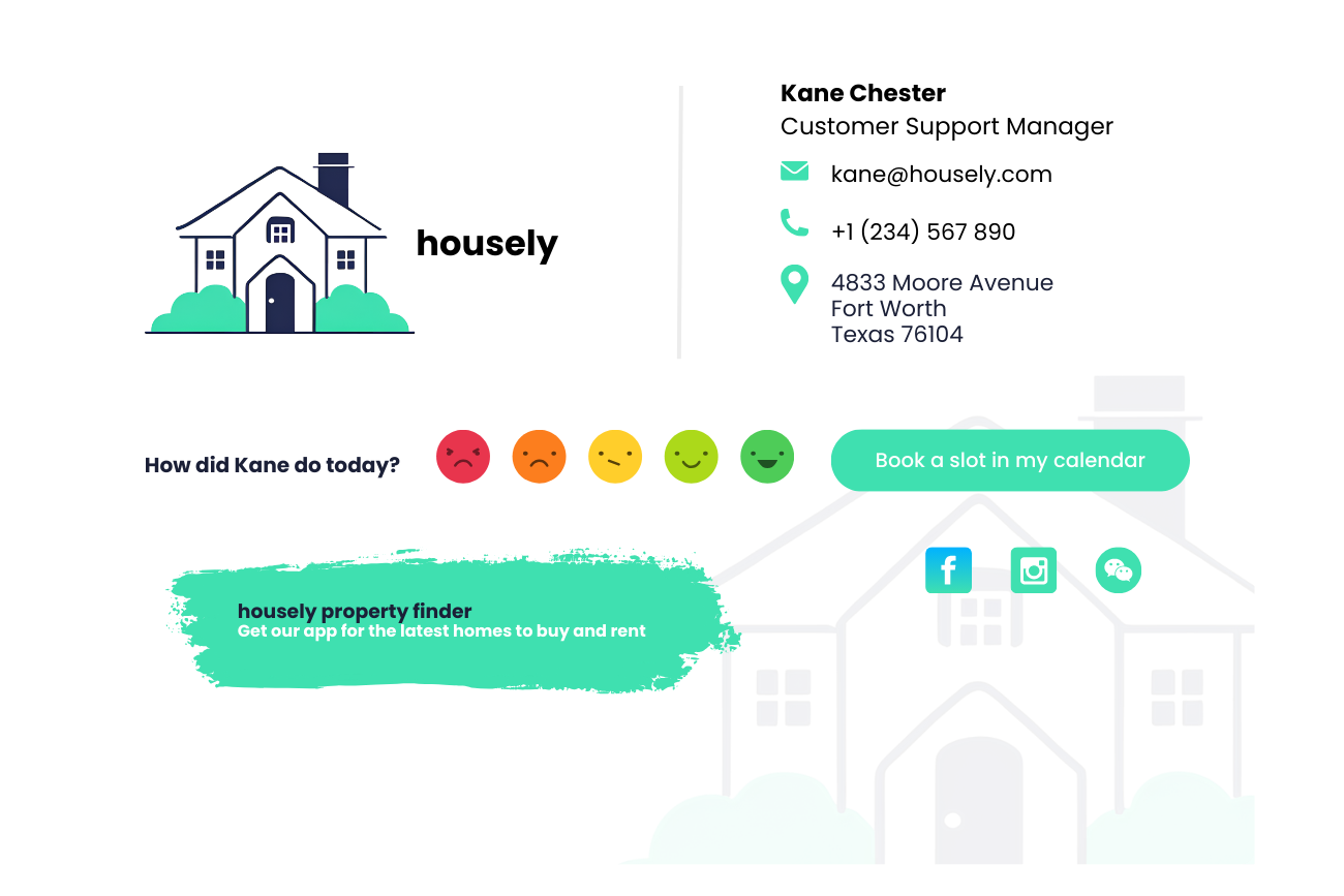
Don’t leave it up to chance
Unspecified image sizes can break layouts, cause alignment issues, or lead to blurry rendering. Use tools that let you control dimensions precisely.
13. Do balance images with text
An email signature should support the message, not overpower it. If you're sending a one-line email, a massive graphical email signature will feel out of place.
 Use a larger version for new conversations and a simplified version for replies or forwards.
Don’t use custom fonts
Custom fonts in an email signature template are possible, but not advisable. Most recipients' devices won't have your custom font installed, so it'll fall back to a default like Times New Roman or Arial instead.
If you have to use a custom font, pair it with a web-safe fallback font. Font size matters as much as font choice: Exclaimer's own template team sizes name and job title at 11-12pt, contact details at 8-10pt, and disclaimer text at 7-8pt, so the hierarchy still reads correctly even before anyone looks at the layout.
14. Don’t skip alt text
Alt text helps your content stay readable, even when images don't load. It also improves accessibility and clarifies the function of each element.
Add short, clear descriptions that match the purpose of the image (e.g., "Follow us on LinkedIn" or "Register for our event").
Do treat images as functional content
Alt text should explain what the user can do, not just what they're looking at.
15. Do use email signatures for marketing purposes
Every email you send is an opportunity to promote something relevant: a product update, an upcoming event, or a new piece of content.
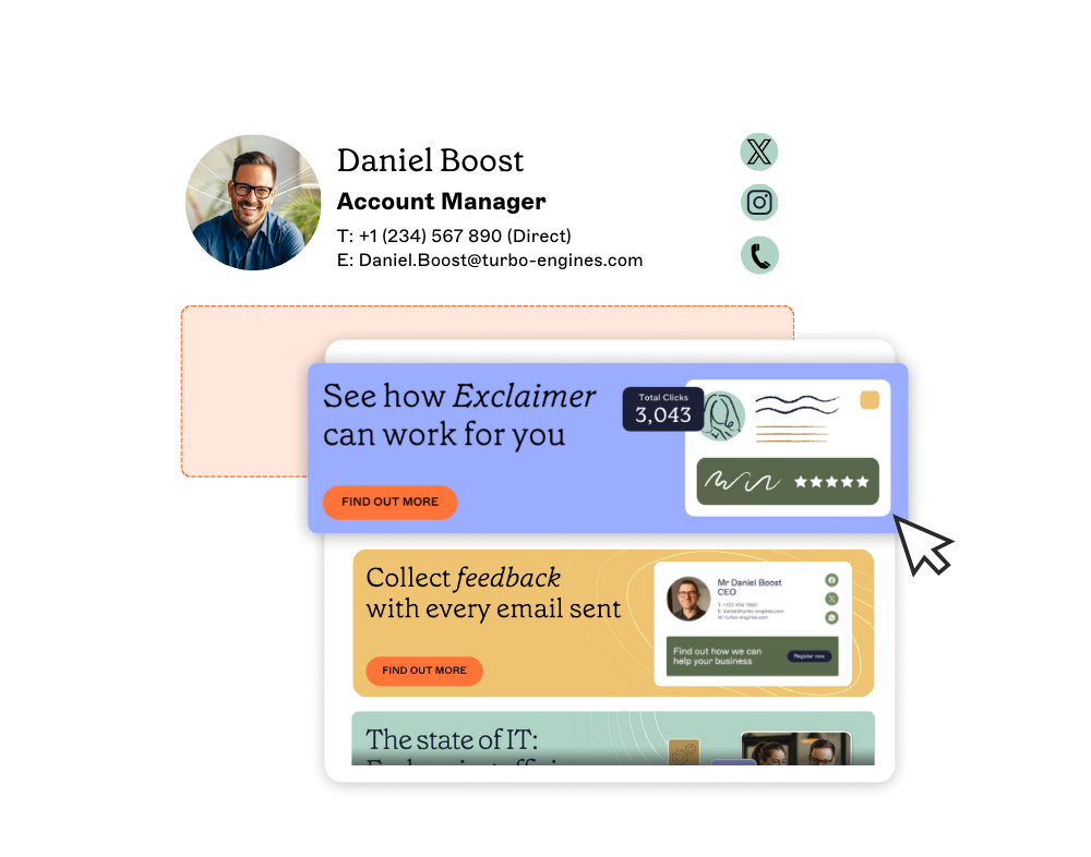 Including email banners, CTAs, or campaign links in your signature keeps messaging consistent and visible without needing to send another email.
Don’t add too much content or use outdated materials
A Christmas promotional banner still running in May is a common, easy-to-miss mistake. Promotional banners need to stay current, which means checking them on a schedule, not just when someone notices.
At the same time, too much content can ruin the formatting and is a standard email signature mistake. A line of text that runs the full width of a 600px email signature will wrap onto the next line in most email clients, especially on mobile, so keep each line short enough to leave visible margin on either side.
“You could consider your signature an advertisement that's displayed on the internal decision-making process: each contact, from CEO to project manager, who sees your forwarded message also sees the content your signature displays.”
Source: Email Signatures for Dummies®
16. Don’t ignore legal requirements
Email disclaimers are a legal requirement in many parts of the world, not a nice-to-have.
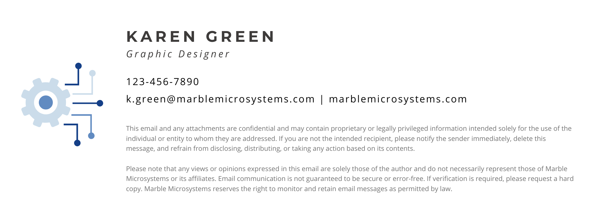 From the Health Insurance Portability & Accountability Act (HIPAA) for U.S. healthcare organizations to the UK Companies Act stating all business emails must include certain business information, look into what laws apply to you and what's needed to comply with them.
Do keep legal copy small and separate
Disclaimers belong in the email signature, not in the spotlight.
17. Don’t overcomplicate email signature design
Email signatures are a real asset, but they don't need to be an enormous effort. There are many intelligent ways to add a personalized email signature design to all emails without bothering your IT department or colleagues.
Do make it easier on your team
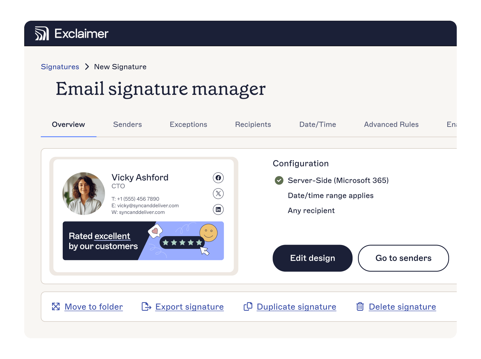
Exclaimer handles the setup, management, and updates, so your IT team can focus on more strategic work.
Learn more about Exclaimer or get yourself a free trial to see the power of email signature software for yourself.