Naimh is a seasoned marketer of 12 years, including in SaaS and tech. She’s an expert at simplifying complex technology concepts, bridging the gap between IT and marketing. Naimh specializes in turning tech speak into actionable insights, helping marketers get the most out of their tools and technology.
Email signature format: How to structure a clear and effective email signature
TL;DR
Email signature format is the structure and layout used to organize contact details and branding at the end of a business email.
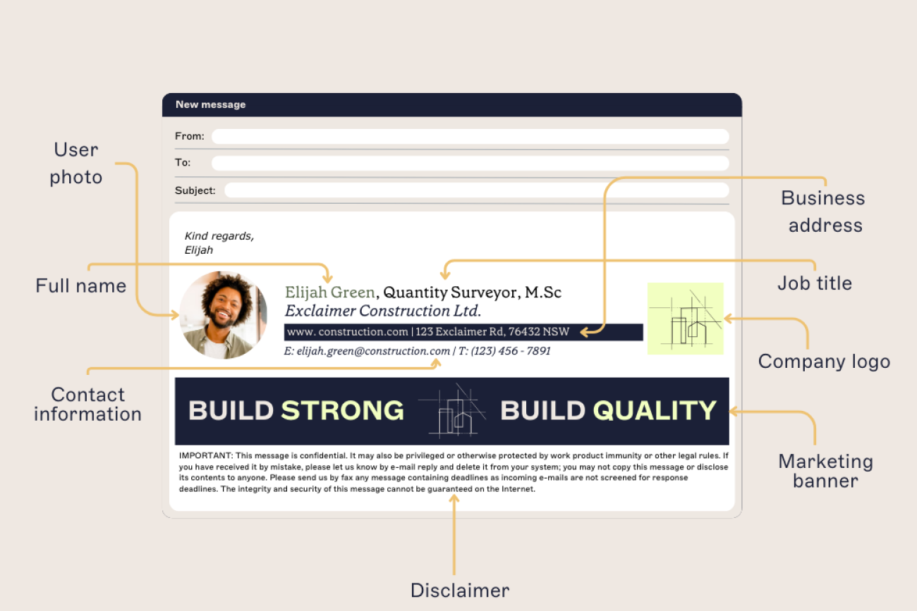
A clear format includes name, job title, company name, phone number, and website, with optional elements like social links, banners, or disclaimers.
Placing the most important information first helps recipients quickly identify the sender and find contact details.
HTML tables, not CSS-based layouts, are the most reliable way to build a signature that holds together across Outlook, Gmail, and Apple Mail.
Keep the signature to at least 600 pixels wide on desktop, narrowing to roughly 320-450 pixels for a mobile-specific build.
Organizations can maintain consistency by standardizing signature templates and applying updates centrally across all users.
What is an email signature format?
An email signature format is the structure used to organize contact details and branding at the end of a business email. It defines the order and layout of the information included in the signature.
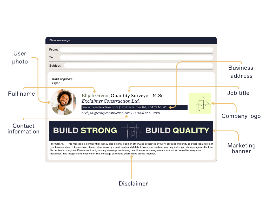 A clear format helps recipients quickly identify the sender and find the right contact information.
A 2026 Exclaimer consumer study showed that when people size up a business email, they look for full contact details (45%), a professional company-domain address (44%), a clear sender name (31%), and a consistent, branded signature (23–24%). Therefore, most business email signatures include:
Name
Job title
Company name
Phone number
Website or social links
Some organizations also add elements such as meeting booking links, promotional banners, or email disclaimers.
When signatures follow a consistent format, emails stay easy to read and organizations maintain a clear, professional communication standard across every employee.
Recommended email signature format
A clear email signature format follows a consistent structure so recipients can quickly scan the sender’s information.
Most business email signatures use the following layout:
Core elements (always include) | Optional enhancements |
|---|---|
Full name | Social media icons |
Job title | Email banners |
Company name (optional, if appears in logo) | Photo image |
Phone number (with country area code) | Feedback surveys |
Email address | Custom links like appointment booking |
Website URL | Award or certification images |
Company postal address | |
| Email disclaimer |
A simple email signature layout puts the sender's name and title first, contact details in a compact block underneath, and any optional elements below that:
Jane Smith Marketing Manager | Example Company
📞 +1 (555) 123-4567 🌐 example.com in linkedin.com/company/example-company
This structure places the most important information at the top while keeping additional elements, such as banners or disclaimers, toward the bottom of the signature.
Email signature format examples
Email signature formats can vary depending on the sender’s role, industry, and communication goals. While most signatures follow the same basic structure, the layout and additional elements often change based on how the signature is used.
The examples below show several common email signature formats used in business communication.
Corporate email signature with contact details and banner
 This layout combines clear contact information with a promotional banner. Key elements:
Name and job title at the top
Direct contact details
Social icons for additional communication channels
A banner highlighting company achievements or news
A legal disclaimer at the bottom
This format works well for organizations that want to maintain professional contact information while also promoting company announcements or campaigns.
Healthcare email signature with promotional banner
 In healthcare settings, email signatures often carry promotional messaging alongside essential contact details. This layout includes:
Sender name and role
Direct contact details
Organization branding
A banner encouraging new patient registrations
A longer legal disclaimer to address privacy and compliance requirements
Industries such as healthcare often need more detailed disclaimers, typically placed at the bottom of the signature so they don't interfere with the main contact information.
Brand-focused email signature format
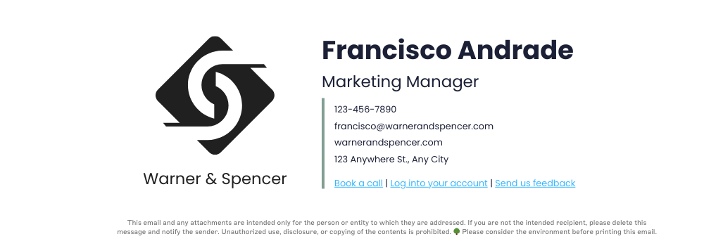
Some organizations design signatures around strong brand visibility. In this format:
The company logo is a prominent visual element
Sender information sits alongside the logo
Action links let recipients book calls or access services
A disclaimer appears below the contact information
This layout works well for companies that want their brand identity to stand out while keeping the signature structured and easy to read.
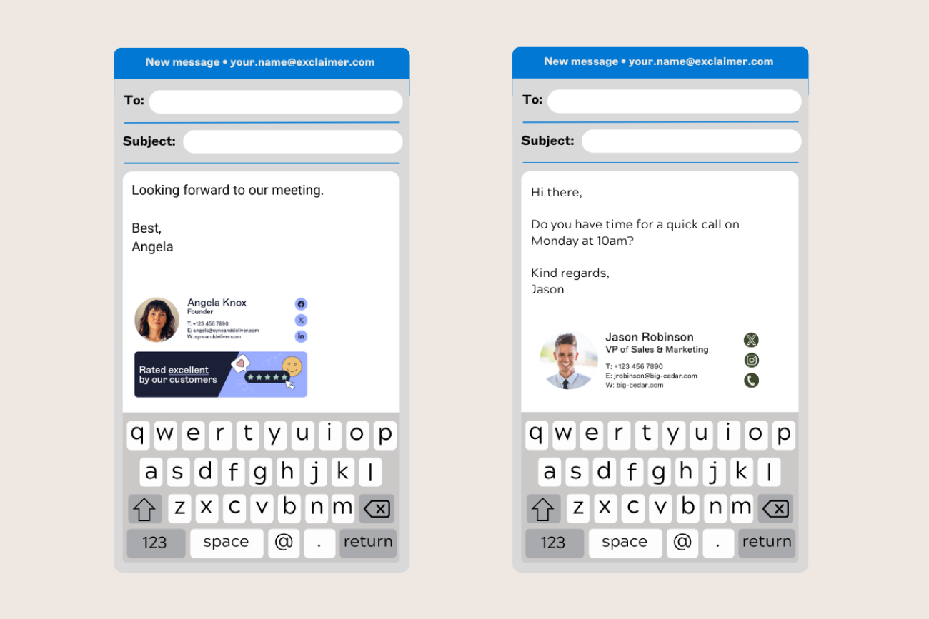
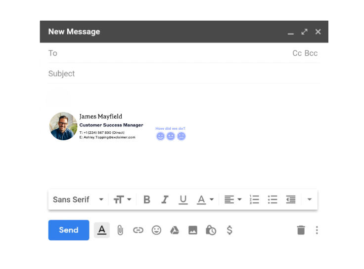
Email signature with feedback request

This example includes:
A professional headshot for personal recognition
Contact details and company information
A one-click feedback survey embedded in the signature
This type of layout is often used by customer service or sales teams to gather quick feedback after interactions.
How different email clients render your format
Email clients don't share a rendering engine, so the same HTML can display three different ways depending on where it's opened. Classic Outlook desktop still renders signatures through Microsoft Word's HTML engine, and that's the main reason table-based layouts hold together better than CSS-based ones: Word's engine supports table structure and HTML width/height attributes reliably but ignores flexbox, grid, border-radius, and CSS background images outright.
Microsoft's newer Chromium-based Outlook for Windows renders much more like a browser, but classic Outlook remains widespread enough in enterprise environments through 2026 that table-based structure is still the safer default. Gmail renders signatures inside its own sandboxed environment and strips CSS it doesn't recognize, including entire style blocks that reference certain properties, so styles need to be applied inline rather than in a stylesheet. Apple Mail uses WebKit, the same engine behind Safari, and offers the most consistent support for modern CSS of the three.
Client | Rendering engine | Table support | Background images | Dark mode behavior |
|---|---|---|---|---|
Outlook (Windows, classic) | Microsoft Word HTML engine | Strong (the recommended layout method) | Ignored via CSS; needs a VML workaround | Full automatic color inversion; no sender control |
Gmail | Custom sandboxed renderer | Supported | Supported inline; CSS background images in a stylesheet can get the whole block stripped | Applies its own automatic color and image adjustments, outside sender control |
Apple Mail | WebKit | Supported | Supported | Full developer control via prefers-color-scheme |
Tip
In dark mode, logos and photos can look muted or hard to see. Put a white background behind the image, or add a stroke around text-based elements, so Gmail and Outlook's automatic dark-mode adjustments don't leave them unreadable.
Building the structure: Tables, width, and mobile
A clear email signature format keeps contact information easy to read while maintaining a professional appearance. Getting the underlying structure right is what makes everything else (banners, logos, mobile display) hold together.
Keep the signature concise
Email signatures work best when they include only essential information. Limiting the number of elements keeps the signature easy to scan and prevents it from distracting from the email itself.
Use HTML tables to structure layout
HTML tables are the most reliable way to build a professional signature that works across email clients like Outlook, Gmail, and Apple Mail. The reason is rendering support: classic Outlook's Word-based engine handles table structure reliably but ignores most modern CSS, so a table-based layout is what actually holds up where it matters most.
Set fixed widths rather than relying on responsive breakpoints, since most signature-building tools can't render responsive HTML
Stack a long address or phone number onto its own line rather than letting it force the table wider
"Tables are your friend. They let you create a more structured design, almost like a piece of architecture — you build the frame first, then put the content inside it. When you're starting a design, think about how many rows and columns you'll actually need before you start filling anything in. And don't be afraid to nest tables within tables. That's what ensures things behave correctly across most devices, especially when it comes to alignment."
Make the signature work on mobile devices
Many business emails are opened on mobile devices. Most signature-building tools can't render responsive HTML the way a website can, so "mobile-friendly" usually means designing to a narrower fixed width (roughly 320-450 pixels) rather than one layout that reflows automatically.
Choosing images, fonts, and colors for your email signature
Once the structure is set, images and type are what make a signature look designed rather than assembled. A few sizing and format rules keep them from breaking that structure.
Optimize images and banners
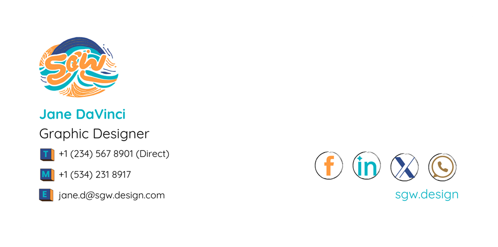
Design and upload logos at 200x200 pixels, and banners at a minimum of 600 pixels wide, matching the signature's own width. Narrow that to roughly 320-450 pixels for a mobile-specific build. Banners are usually placed beneath contact details so they support communication without interrupting the layout.
Stick to standard image formats
Use GIF, PNG, or JPEG for logos, icons, and banners. SVGs, despite working well on websites, aren't supported in email signatures at all. Animated GIFs carry one more catch: some clients only display the first frame, so the still image needs to make sense on its own. Keep sizing consistent, and always include descriptive alt text in case images don't load or the recipient uses a screen reader.
Whether to embed or host images depends on how the signature will be viewed: mobile devices and clients like Outlook or Gmail can restrict what's supported, so hosting images online instead of embedding them helps avoid attachment issues.
Avoid clutter in your email signature format
Simple layouts render better and produce fewer formatting errors. Most email clients size type in points rather than pixels, so plan for a tiered hierarchy
Text | Point size |
|---|---|
Name and job title | 11-12pt |
Contact details (phone, email, website) | 8-10pt |
Disclaimer or lower-priority text | 7-8pt |
A few more habits keep the layout sharp: use web-safe fonts like Arial or Calibri, stick to one or two font sizes and colors, don't overload the signature with graphics or banners, and avoid animations or large file sizes.
To see how your formatting will render, try our free email signature generator.
Accessibility considerations in email signature format
Format decisions affect more than how a signature looks. A screen reader announces alt text for every image in a signature, so a logo or headshot with no alt text is either skipped silently or read aloud as a meaningless filename. Some organizations go further:
Cornell Lab of Ornithology's brand guidelines direct staff to skip logos and other graphic elements in signatures entirely, citing accessibility and cross-client rendering issues, and to use type only.
For most businesses, dropping every graphic isn't necessary. The lower-effort fix is to treat alt text as a required field, not an afterthought: describe what the image is ("Example Company logo"), not what it's for, and leave alt text empty (not missing) for purely decorative elements so screen readers skip over them cleanly.
Email signature mistakes to avoid
Even when the right elements are included, poor formatting can make an email signature harder to read or inconsistent across an organization. Avoiding a few common mistakes helps keep signatures clear and professional.
Including too much information
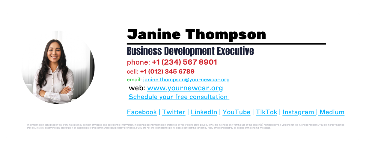
Signatures with multiple phone numbers, addresses, social profiles, and graphics can quickly become cluttered. Limiting the signature to essential contact details keeps the layout easy to scan.
Using oversized images or banners
Large graphics may not display correctly in every email client and can slow down email load times. Images should be optimized so they appear consistently across devices.
Adding too many social icons
Social links can provide useful context, but including too many social icons can disrupt the visual balance of the signature. Most signatures benefit from including only one or two relevant platforms.
Using inconsistent formatting
When employees create their own signatures manually, fonts, spacing, and layouts often vary. This isn't a hypothetical risk: 33% of organizations report employees ignoring signature guidelines altogether, per Exclaimer's State of Business Email 2025 research. Inconsistent formatting like this leads to inconsistent branding and makes communication look less professional.
Placing promotional content above key information
Contact details should appear at the top of the signature. Banners or promotional content should sit below the sender's name and contact information so they don't distract from the primary details.
How to keep email signature formats consistent across an organization
Maintaining a consistent email signature format across an organization gets harder when employees manage their own signatures. Different layouts, fonts, and contact details quickly lead to inconsistent branding across business emails.
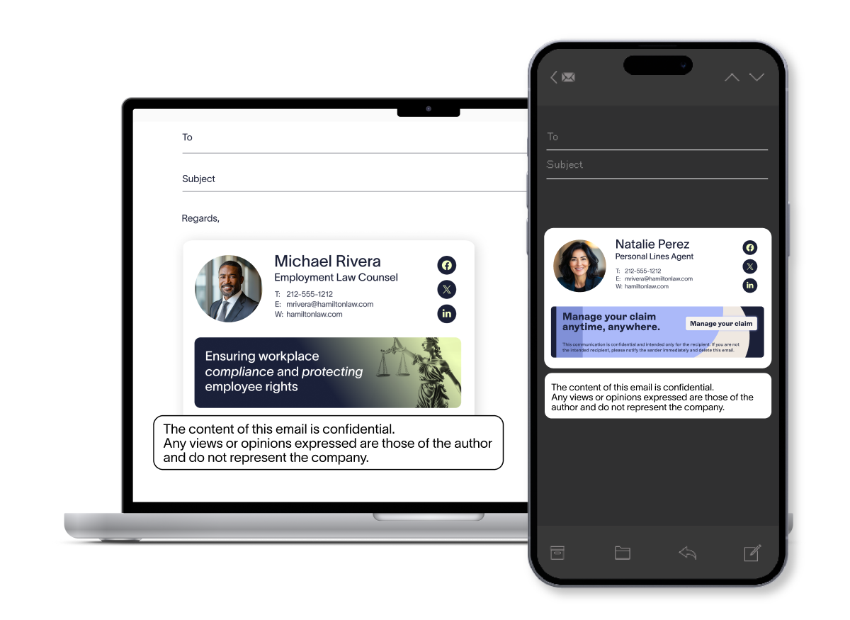
Standardizing the format helps ensure every message includes accurate contact details and presents a professional appearance.
Define a standard email signature format
Organizations should set a clear structure for email signatures: the order of contact details, branding elements, and any required disclaimers.
Provide approved signature templates
Pre-designed templates make it easier for employees to use the correct format and reduce formatting errors.
Keep contact details updated
Employee roles and contact information change often. Signatures that update automatically keep contact details accurate across the organization.
Apply updates across all users
When branding, campaigns, or legal requirements change, signatures need updating across every employee. Applying updates centrally keeps every message on the same format without relying on each person to make the change themselves.
Why use Exclaimer
Every format rule in this guide holds up when one person builds one signature. It breaks down at the point most companies actually hit: dozens or hundreds of employees, each interpreting "keep it simple" differently. 80% of organizations still rely on manual methods or user self-service for their email signatures, according to Exclaimer's State of Business Email 2025 research (Censuswide, 4,009 IT professionals, UK/US/Germany/Australia). That's the gap between a documented standard and a format that actually stays consistent.

Exclaimer's cloud solution closes that gap by taking format out of employees' hands entirely. IT designs the signature once, using the same table-based, client-tested structure this guide covers. It then applies automatically to every outgoing email on every device, with no employee copying and pasting HTML and no IT time spent chasing down who's still on the old banner.
Centrally manage email signatures from one dashboard. No local setups, no manual edits.
Apply legally required disclaimers to every message automatically, with no risk of removal.
Design once, apply everywhere: templates update company-wide in minutes.
Control who can edit what: let marketing own banner content while IT locks the legal layout.
Track performance: measure click-throughs and engagement with built-in analytics.
See how Exclaimer's email signature management keeps every employee's format on standard, or book a demo to see your own signature format applied across your organization.